Create Folding Edges in CSS3
We are going to create folding edges using CSS3. It looks very cool in design. When I need to create folded corners in CSS to design a notification box in my client website. I just created using simple codes. Which is given below.

HTML Code for Folding Edges
HTML code for design basic and simple. E.g :
<div class=”notification”>
<div class=”notify-title”>Title</div>
<p>The content will be added here</p>
</div>
Styling Box using CSS
Now I design box in CSS and giving positions to title and content elements as given below :
.notification {
position: relative;
padding: 23px 10px 22px;
margin: 20px;
background: #fffdf2;
border: 2px solid #ffcb00;
font-family: Helvetica, Arial;
}
.notify-title {
position: absolute;
top: -10px;
left: -10px;
padding: 4px 8px;
background: #df9c00;
color: #fff;
}
Output of above code show as :
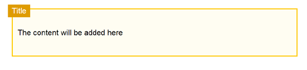
I give the position “relative” to main container box because other elements like heading and paragraph content positioned relative to container box i.e .notification in this case.
Add Folding Effect to Edges of Title
So to add folding effect in edges we need to create small triangle in dull color, which is possible by using :effect (The :after selector inserts content after the selected element). We use content: ‘ ‘ property to specify text. But in this case we don’t need any content to show, so we keep the value empty in content property. Code is given below :
.notification {
position: relative;
padding: 23px 10px 22px;
margin: 20px;
background: #fffdf2;
border: 2px solid #ffcb00;
font-family: Helvetica, Arial;
}
.notify-title {
position: absolute;
top: -10px;
left: -10px;
padding: 4px 8px;
background: #df9c00;
color: #fff;
-webkit-box-shadow: 1px 1px 2px rgba(0,0,0,0.3);
-moz-box-shadow: 1px 1px 2px rgba(0,0,0,0.3);
box-shadow: 1px 1px 2px rgba(0,0,0,0.3);
}
.notify-title:after {
content: ”;
display: block;
height: 20px;
width: 8px;
position: absolute;
top: 24px;
left: 0px;
background: transparent;
z-index: -1;
border-top: 50px solid #eed993;
border-left: 45px solid transparent;
}
Now the Output is shown as :

Note that a small triangle makes illusion of folding corners.We also add some shadow effect using box-shadow property in CSS3. To test this code in your browser, create a new html file and paste the final code in it which is given below.
<html>
<head>
<style>
.notification {
position: relative;
padding: 23px 10px 22px;
margin: 20px;
background: #fffdf2;
border: 2px solid #ffcb00;
font-family: Helvetica, Arial;
}
.notify-title {
position: absolute;
top: -10px;
left: -10px;
padding: 4px 8px;
background: #df9c00;
color: #fff;
}
.notification {
position: relative;
padding: 23px 10px 22px;
margin: 20px;
background: #fffdf2;
border: 2px solid #ffcb00;
font-family: Helvetica, Arial;
}
.notify-title {
position: absolute;
top: -10px;
left: -10px;
padding: 4px 8px;
background: #df9c00;
color: #fff;
-webkit-box-shadow: 1px 1px 2px rgba(0,0,0,0.3);
-moz-box-shadow: 1px 1px 2px rgba(0,0,0,0.3);
box-shadow: 1px 1px 2px rgba(0,0,0,0.3);}
.notify-title:after {
content: ”;
display: block;
height: 20px;
width: 8px;
position: absolute;
top: 24px;
left: 0px;
background: transparent;
z-index: -1;
border-top: 50px solid #eed993;
border-left: 45px solid transparent;
}
</style>
</head>
<body>
<div class=”notification”>
<div class=”notify-title”>Title</div>
<p>The content will be added here</p>
</div>
</body>
</html>
I hope this web designing tip will make you surprise. May be I am not the first one who create this, but I want to tell you how beautifully you can create this illusion effect in CSS codes without using any image.
Create Folding Edges in CSS3
 Reviewed by Freelance Web Designer
on
April 27, 2020
Rating: 5
Reviewed by Freelance Web Designer
on
April 27, 2020
Rating: 5
Reviewed by Freelance Web Designer
on
April 27, 2020
Rating: 5


No comments: